How we built our own design system
Remember that episode from F.R.I.E.N.D.S. when Chandler decides to go into advertising and wants to create a new and innovative slogan for cheese, saying “Cheese. It’s milk that you chew.”? Very much like the cheese slogan, wheel and the login page, some things just don’t need to be reinvented.
Ask the nice folks at Hubspot. Their experience while redesigning their already complex platform was sprinkled with epiphanies related to design components that had been unnecessarily reinvented (aka inconsistencies in design): they had over 100 shades of the colour grey, 8 types of date pickers, more than 40 text styles in 3 different fonts and the list continues.
As they put it, the reason teams had reinvented essentially the same styles and components was because their “organisational structure created visibility issues. In short, it was very hard to discover what was already in play, and easier to just build something new.”
Alignment issues which arose between several autonomous design teams forced the designers to “reinvent” elements as they needed them. It was clear that a better system was needed, one that would help designers and developers across teams and geographies tap into a single source of truth: the design system.
Although we build many digital products for our clients and don’t focus solely on a single complex platform the way Hubspot does, we too felt the need to ensure designers and developers have direct access to a wealth of reusable design components. Our main goal was to gain speed and efficiency when kicking off new projects - two key elements especially for startups in the pre-MVP stage.
What is design system?
Very simply put, a design system is a continuously evolving collection of elements that can be mixed and reused to build awesome digital products. It’s a repository of components, constraints and rules that enables all members of a team to “speak the same language” when creating a digital product.
Benefits of design systems
- Speed: having access to ready-made components which are highly structured makes it possible for the entire team to move with increased velocity. For us, it means faster iterations, rapid prototyping and, overall, a more engaged team that doesn’t need to do repetitive work. For the client, this translates to smaller budgets and more time to focus on the business-side of the project.
- Centralized knowledge: a design system gets everyone on the same page, it facilitates a smoother onboarding process for new hires/ new team members, mitigates the risk of losing know-how once a team member leaves and it encourages consistency throughout your product. Also, a well-maintained design system ensures all team members are using components which are up to date - a tricky thing especially when dealing with large, complex platforms and geographically-distributed teams.
- Scalability: the sheer fact that a design system is built around the reusability principle means that your team doesn’t need to redesign (implementation is a different story) every single button for Android Native, Swift, React or any other language or framework which requires different styles. Also, having well-defined standards and documentation related to usage and behavior increases the chances that the UI remains consistent when scaling the product.
- Increased collaboration & better communication: a product team consists of a wide range of individuals with complementary skill sets: project managers, designers, developers and testers which - especially nowadays - need to communicate better than ever. Having the same vocabulary when talking about a product helps avoid communication breakdowns. In return, this reduces friction and increases productivity and team-work which fosters creativity and problem-solving.
Shortcomings of design systems
Although many items on this list can be argued against, this is a collection of common concerns teams might express when contemplating the idea of building a design system:
- It takes time and resources to build it, defocusing team members from the project’s roadmap.
- Maintenance can be cumbersome.
- Some designers might see it as a brake on their creativity.
- Unifying practices throughout the organisation can create disruption.
Why we decided to build our own design system
Since 2010, we’ve built close to 150 digital products. Although we’ve never had 2 identical projects, after tens of iterations, patterns started to appear. Be it a FinTech platform, an eLearning solution or a dry cleaning app, we always had to build from scratch a common set of features (login/registration, user management, dashboards, reports, etc). This meant time and effort from our development and design teams which reflected on the overall budget for the project.
Staying true to our company values, we strive to make a good thing better, so, when we see the opportunity, we build our own systems to improve our work.
From a technical standpoint, we tried to increase efficiency and create more value by building Ivory - our own framework for kicking-off new projects. This framework is designed for business efficiency by putting together the best and most popular technologies so that the software team can automate all the common functionalities of an app and focus on developing value-adding features.
In early 2019, our CEO and founder, Ilie, came up with the idea to have a similar approach to our design process. Why not build a library of reusable components to streamline the design process, to promote innovation, and enable our team to deliver fast and more efficiently? Enter our Design System called "Kogaio".
How we built our design system
Looking back, we had 5 main stages in our journey:
- Assemble the legion & make a plan
- Research
- Weekly debates
- Design
- Iterate, update and maintain the UI Kit
- Plan to implement the new design components into the Design System
1. Assemble the legion and make a plan
The entire design team was involved in building the design system. Our COO, Andrei, who’s also an experienced Product Owner, supervised the process, making sure we applied the same Agile principles to this endeavour as we would have done with any other product development project.
Planning was the cumbersome part, considering all designers had a myriad of tasks to get done throughout the day, but we stuck to the roadmap as best as we could.
2. Research
We had heard about it but we never really researched this topic until early 2019. To get a more in-depth understanding of what a design system looks like and how it works, we dug the internet to see what the industry leaders were building.
Three design systems caught our eye: AXA, Heartbeat’s Pulse and Adobe’s Spectrum. We focused on them and tried to learn as much as possible from their experience refining the design system and implementing best practices.
Next, we followed the Atomic Design methodology. We’re really hooked to its brilliant simplicity and ease of use.
Atomic Design
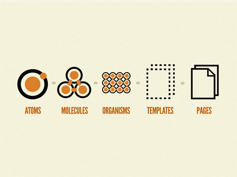
As explained by its creator, Brad Frost, “Atomic design is a methodology composed of five distinct stages working together to create interface design systems in a more deliberate and hierarchical manner.”
He advocates that, similarly to how the known universe can be broken down into a finite set of atomic elements, the interfaces of our digital products can be as well. According to this methodology, all digital products are made up of small individual atoms which are the building blocks of increasingly complex elements and components.
The five stages of atomic design are:

Source: Atomic Design by Brad Frost
- Atoms
All basic HTML elements such as buttons, inputs, labels and all else which can’t be broken down further without losing functionality. - Molecules
Simple groups of UI elements which work together to serve a purpose (e.g. a button, an input field and a form label: clicking the button atom submits the form). - Organisms
More complex UI components made up of molecules and/or atoms and/or other organisms. Think of a header, a popup or a grid used for product listing on almost all e-commerce websites. - Templates
Page-level objects that place components into a layout and showcase the design’s content structure. A homepage template, for example, displays all the useful components. It’s still bare-bones without real, relevant content; this is next up. - Pages
Pages are created by adding real content - images, text, all types of media - to the templates. Apart from representing the final interface your users will interact with, this is the moment when you can test the effectiveness of the underlying design system and see if the patterns you’ve envisioned look and work as they should.
3. Have weekly debates
Before creating new stories for new sprints we had brainstorming sessions about what elements we need for new projects. We would, then, debate them and arrive at conclusions that would get reflected in new tasks in Jira.
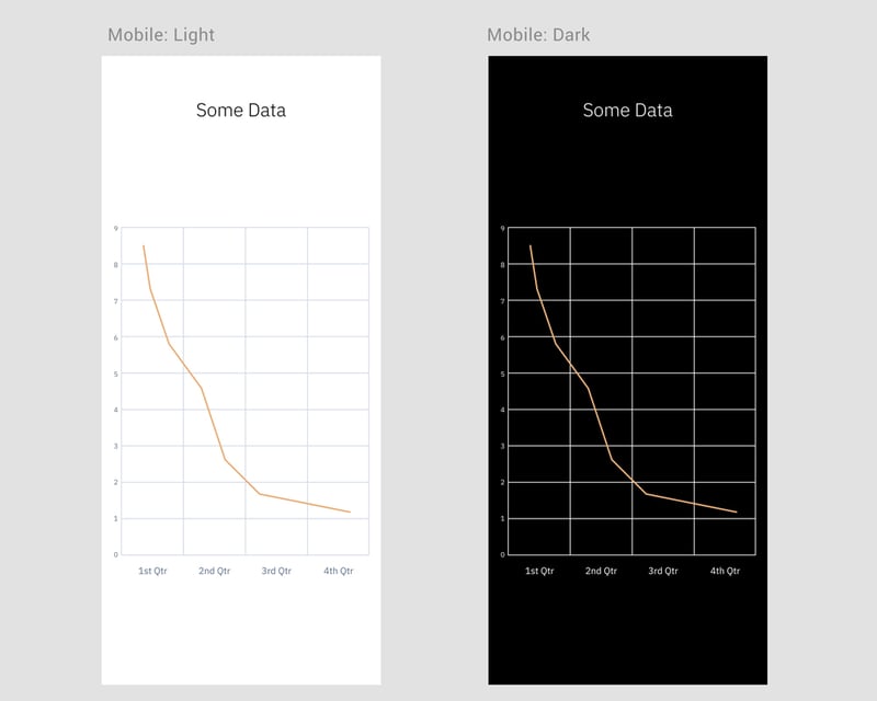
For example, while working on Etvas, we realized we needed to design some charts. Since many of our projects require this component, we decided to add a charts component in the design system as well. We now have 3 types of charts included.
4. Design
To keep ourselves focused and not miss anything, we looked for a nice checklist to guide us in the creation of our Design System so we used this open-source checklist.
The actual grunt work was done by a single team member, all others offering support and pitching in when they had some down time from the projects they were allocated to.
The tool of choice for our design team is Figma, so the Design System was built with it as well. Being such a collaborative tool, Figma allows developers to jump right in, regardless of the operating systems they use, and access the designs and all deliverables.
Most elements in our design system are scalable, making use of 2 extremely useful Figma functionalities: Auto Layout and Constraints. They helped us create dynamic designs that allow our team to get rid of the tedious task of resizing elements to fit different screen sizes.
5. Iterate, update and maintain the UI Kit
In order to add elements to the Design System, we scheduled a weekly designers meeting. We debated the usefulness of adding certain elements. This is an “all hands on deck” type of operation, everybody shares what they worked on the past week, what elements they’d add & why and make decisions. This process of debate aims to analyse and conclude what elements would truly be useful to add.
We’re all aware that the system is fluid, that it will need maintenance and updates but it shouldn’t be such a scary thought. Looking at the speed at which trends in visual design shift, we foresee that it will take a couple of years until a complete re-work of our design system will be mandatory. After all, considering that the New Skeuomorphic design is just the old skeuomorphic design whose elements have been stripped down to the minimum, we, too, can adapt our elements so as to be up to date.
6. Plan to code the new design components into the Design System
As Brad Frost said — “there is real value in using static design tools to work with a design system, but be sure to keep your eye on the prize: creating a beautiful, flexible, reusable collection of frontend components that can be used to build real software.” so after designing the new components, the next step is to code them into our design system, Kogaio. This is an effort conducted by the front-end team in close collaboration with the design team.
A quick glance into our design system
One thing we did differently was that we didn’t create Pages nor Templates - the last 2 stages described in the Atomic Design methodology. We build very many different types of apps and platforms. It wouldn’t make sense to pre-build such complex components blindly. If our work had been more focused on a niche - marketplaces, let’s say - it would have made great sense to have a library of prebuilt templates and pages to choose from. So, as Brad Frost himself advises, we embraced this methodology but adapted it to our own business particularities.
It took us roughly 3 months to build a wealthy database of elements (atoms, molecules and organisms), using the principles of Material Design but it was worth it. We’re now looking at hundreds of elements which both our designers and software developers find extremely useful.
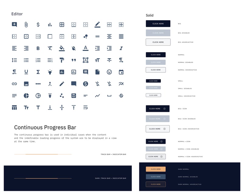
Icons, Buttons, Progress Bars? We’ve got’em:

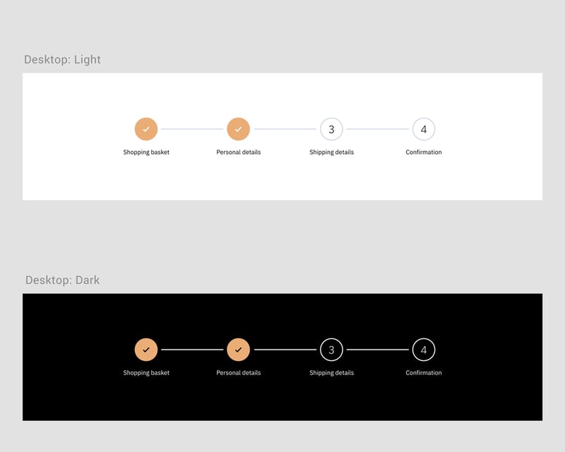
The molecules section is rich in lists, data tables, progress trackers and many other components.

Navigation, headers, charts, we’ve created several versions in our Organisms library.

Ana, one of our software engineers, was one of the first people to use our new UI kit in order to create a new design system for a product. She liked the style guide most of all. She loved the fact that all the colours for both light and dark modes were there, neatly organised for every platform (iOS and Android) and that it was clearly specified what colour needs to be used on what components.
Design system 1 - old design process 0.
Final thoughts from the design team
You are interested in this concept and you plan on building a Design System in your company. That’s a great decision. Just make sure that you have the resources to code and update it with the latest components. A design system is a living organism so make sure you feed it.
Since this whole journey was a learning experience for the entire team, as it’s always the case when acquiring new skills, it’s important to start executing right away so that you see what works and what doesn’t.
Did you build a new component in your project, worth reusing? Pitch the idea to your team and add it to the library so others can benefit from it.